Native dark theme for your website
Project | Article by Maarten Tromp | Published | 612 words.
Introduction
Implementing a dark theme is quite simple. All you need is some basic HTML and CSS. It will improve site accessibility and keep users like me happy.
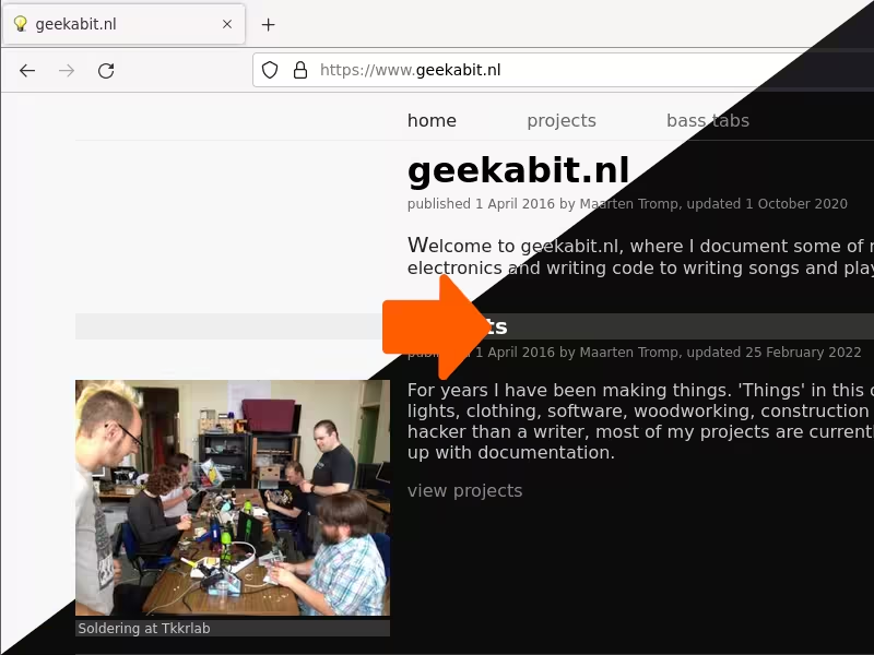 Website shown with half light and half dark theme
In this article:
Since a few years there has been a lot more attention for dark mode (a dark theme, also known as night mode). I noticed this trend in 2019 and started reading up on it. After doing experiments and implementing it on this website I realized it was not hard to do. To my surprise today many websites do still not have a dark theme. Some that have one, have implemented it in JavaScript or other in complicated ways. There is no need for that though. In this article I will show how to do it in a simple and elegant way in HTML and CSS only. The theme will match what your operating system is set to, so you can have a light theme during the day and a dark theme in the evening, without manual switching.
CSS supports the use of variables. So instead of specifying colour values in multiple places, you can define a colour once and use the variable in the rest of the stylesheet. Furthermore, CSS detects the preferred colour scheme for you with the prefers-color-scheme media feature. So you can define one set of colour variables for a light theme and another set for a dark theme. Keep in mind that prefers-color-scheme can also be empty, so you should always specify a default theme.
CSS
:root {

    /* default theme */

    --color-text: black;

    --color-background: white;

}

@media (prefers-color-scheme: dark) {

:root {

    /* dark theme */

    --color-text: lightgrey;

    --color-background: black;

}

} /* end of @media (prefers-color-scheme: dark) */

body {

    color: var(--color-text);

    background-color: var(--color-background);

}
HTML
<p>This text colour and background colour will be defined in CSS, depending on the selected colour scheme.
CSS can also show or hide elements depending on the preferred colour scheme. You can create a class that's only visible in one theme and hidden in the other. By assigning these classes to images (or other HTML elements) you can show the appropriate image for the selected theme.
CSS
.light {

    display: initial;

}

.dark {

    display: none;

}

@media (prefers-color-scheme: dark) {

.light {

    display: none;

}

.dark {

    display: initial;

}

} /* end of @media (prefers-color-scheme: dark) */
HTML
<img class="light" src="image-light.png" alt="only shown when using a light theme">

<img class="dark" src="image-dark.png" alt="only shown when using a dark theme">
For making a dark version of a light image I use ImageMagick. It's a simple command-line tool that can batch convert and is also available for php, python and many other languages. The following example will invert the image, setting minimum and maximum brightness values.
convert -modulate 100,100,0 +level-colors "#cccccc","#0c0c0c" image-light.png image-dark.png
SVG images can be dealt with the same way as regular images by using <img src="image.svg">, however there is a more elegant solution. In CSS you can specify SVG stroke and fill colour, but this can only be applied if the SVG is part of the DOM. So the image has to be either declared inline or imported using xlink. Make sure you have defined a symbol and specify a viewBox.
Stroke and fill colour are not inherited from the color property, so they have to be set explicitly, but you can use currentColor, which acts like a variable that is set to the current color property. When you need the background colour you can set opacity="0".
CSS
:root {

    --color-text: black;

}

@media (prefers-color-scheme: dark) {

:root {

    --color-text: lightgrey;

}

} /* end of @media (prefers-color-scheme: dark) */

body {

    color: var(--color-text);

    fill: currentColor;

    stroke: currentColor;

}
HTML
<svg viewBox="0 0 1 1">

    <use xlink:href="image.svg#symbol"></use>

</svg>
SVG
<svg xmlns="http://www.w3.org/2000/svg">

    <defs>

      <symbol id="main" viewBox="0 0 1000 1000">

          <!-- image goes here -->

      </symbol>

    </defs>

</svg>
It took me a while to figure out which role each of the two viewBoxes has. The viewBox in the SVG is the actual viewBox on the image, with x, y, width and height. The viewBox in HTML should have x=0, y=0 and the same width to height ratio as the viewBox in SVG, but the absolute values don't matter. What I do is copy width and height from the SVG to HTML and set x and y to 0. Also, make sure viewBox is properly capitalized, otherwise the SVG symbol viewbox is ignored, but the HTML viewBox will still be rendered.
Most browsers can help you test themes by forcing prefer-color-scheme to light or dark. Here is how to do this on Firefox and Chrome.
You see, it is not hard at all. Now go forth and apply!
Examples from this page can be found in the downloads directory of this article.